An AI document dashboard to help users with task management and troubleshooting.
Basic Information
My Role
Research, Paper Prototyping, Low-fi Prototyping, Design Systems, Hi-fi Prototyping, Information Architecture, Interaction Design, Motion Design, Photography & Videography
Project Type
Internship project collaborated with Orby AI
Team
(Allen)Xianzhongge Liu, Jing Xu, Julia Zhu, Kevin Huang Leah Li, Linkang Hu
Duration
12 weeks
Tool
Figma
Date
January 2023 - March 2023
Overview
01 Background
Nowadays, there are many AI platforms that can help bring the "auto-complete" experience to everyday business users and automate mundane and repetitive tasks. Orby AI is one of them that can help businesses automate mundane and repetitive tasks, reduce errors, and increase efficiency by enabling auto-complete functionality.
02 Outcomes & Impact
Significantly improve the productivity of Google's special analysts and administrators.
Based on the dashboard project, Orby acquired new client resources, like Uber.
03 Orby AI
Orby AI is building the next-generation AI platform to bring the "auto-complete" experience to everyday business users and automate all mundane and repetitive tasks.
The company is backed by top-tier VCs with a track record of investing in category-defining companies. The founders, coming from Google and UiPath, are a strong team with deep knowledge of the Automation space and deep AI domain expertise. The Orby AI team is creating a future in which everyone can use AI to save time and achieve their full potential.
Stakeholder Interview
What do we want to investigate through stakeholder interviews?
Goal 01
Get familiar with the scenarios of users' work routine & user goals
Goal 02
Know what data to monitor for trouble shooting
Goal 03
Define the design scope and understand the considerations from our client
What we have learned through stakeholder interviews:
Competitive Analysis
Through learning from the best practices in the adjacent fields, we gained 3 main insights for dashboard design:
Insight 01: Alert System
Good dashboard design = explanatory + exploratory. Providing Alert/Insight enables users to make better judgement in daily work.
Providing summary of metrics helps users quickly know what to monitor at a glance, and avoids losing time by getting lost in huge amount of data.
Insight 02: Key Metrics Summary
Insight 03: Data Visualization
The overall layout needs to be simple and efficient; The reasonable data visualization provides an easy path for users to acquire info and interact with data.
Problem Reframe
Based one the previous interview and analysis, we narrowed down the design scope:
How might we design a dashboard to better
display key metrics,
and help target users to
quickly find outliers?
Persona
User Story
Information Architecture
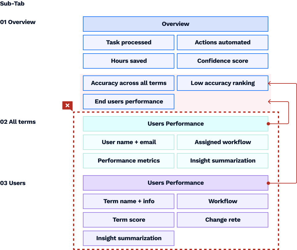
Organize Input Data
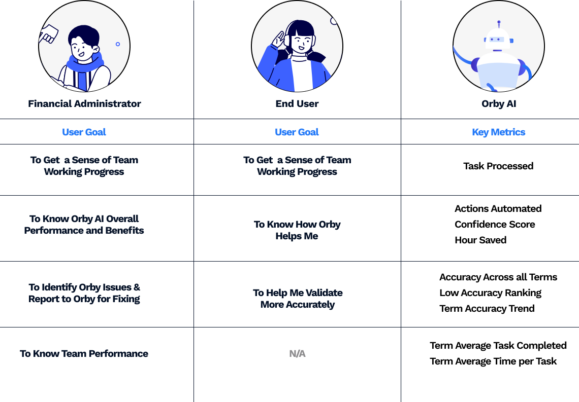
We turned the insights from competitive analysis, stakeholder interviews, and personas to information structure to figure out what data is more valued for admin and end user so that we can make that information more dominant in the dashboard and task tabs to help troubleshooting and task management.
Iteration
01 User story to wireframe
To know Orby overall performance and benefits
Admin Goal 01
What
01
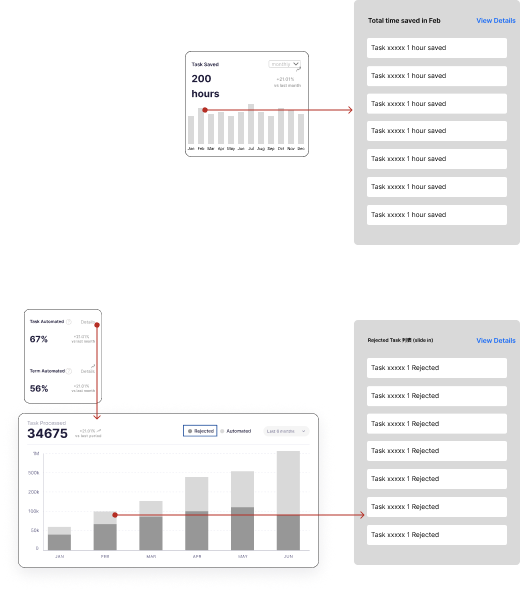
Total time saved for my team, so that I can know the ROI of using Orby.
Total tasks automated. I may need to drill down to see the rejected ones so that I can know why they reject these and figure out whether there is anything to do for improvement.
02
How
Admin Goal 02
To know end-user performance
What
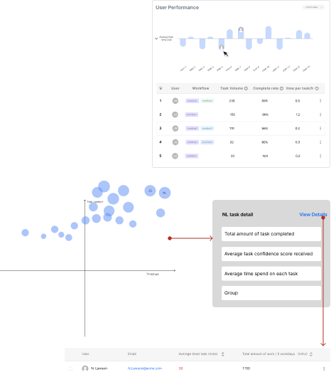
Performed time/per task compared to average (maybe filter by workflow) so that I can identify the outliers.
01
Most users should have similar performance.
If over-perform, check if the user is doing the job correctly.
02
How
Admin Goal 03
To identify Orby issues & report to Orby for fixing
What
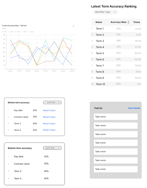
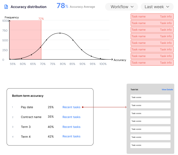
Term accuracy per term per workflow, so that I can get a overview sense of Orby performance and identify whether there is an outlier.
01
Accuracy ranking by term so that I can identify the ones that may have definition issues and low accuracy and may need to report to Orby.
02
How
User Goal 01
To get a sense of my performance
What
01
My total pending tasks so that I can get a sense of how much work is left.
Total task number I worked with Orby last time period and compare to the last last time period, so that I am motivated to work more.
02
How
User Goal 02
To help me validate more accurately
What
Accuracy across all terms to see the overall performance. But I need to drill down to see the outliers.
01
Accuracy across all terms/ per workflow/ per term. If I know a term Orby processed is very un-accurate, I would pay attention to that term later on. If it is accurate, I would confirm it immediately.
02
How
User Goal 03
To know how Orby helps me
What
01
Total hours Orby helped me saved.
02
Total Terms Orby helped me automated.
How
02 Build structure
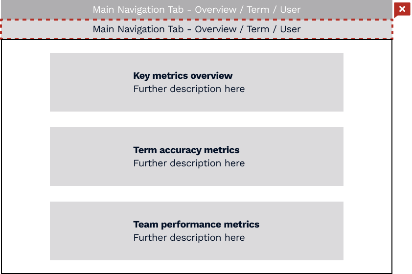
In the 1st round of iteration, we eliminate the initial idea of sub-tab design to:
· Limit redirection in user experience
· Reduce the difficulty in the development process
· Simplify information architecture
Data Re-organization
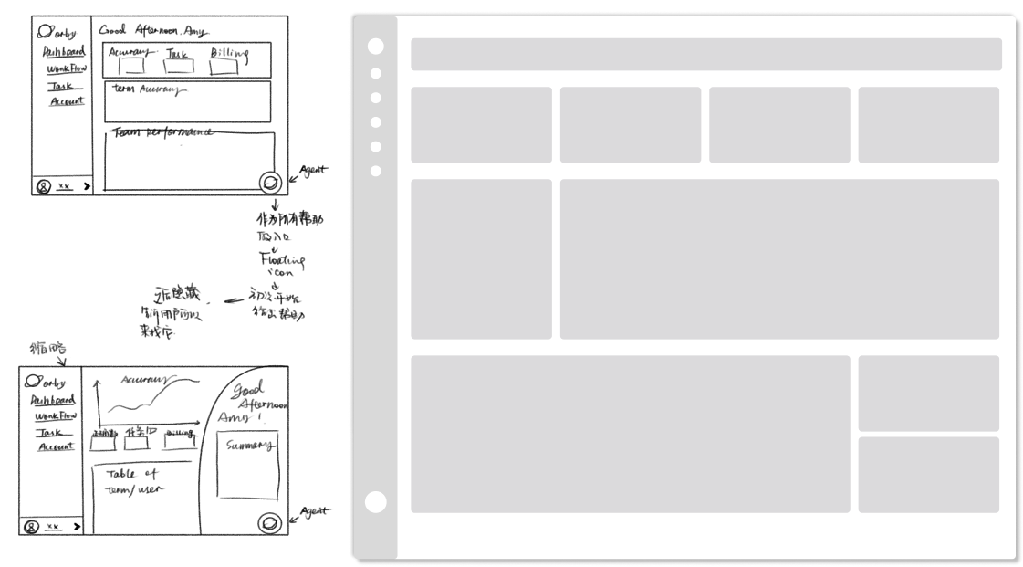
03 Organize charts
From low-fi to mid-fi to hi-fi, we explored different forms of organization.
For the final version, we:
· Keep everything modular
· Prefers horizontal rather than vertical for better data visualization & readability
Winner!!!
Vertical
Tri-column
04 Visualize metrics
Before diving into the detailed design, we explored what method to visualize each data with 3 questions in mind:
01 What is the purpose of each visualization, is it for display, for comparison or for indicating trend?
02 What would be the most efficient form to let people understand immediately?
03 Whether different data needs to be expressed in more than one chart, for example, team performance?
05 Dashboard layout
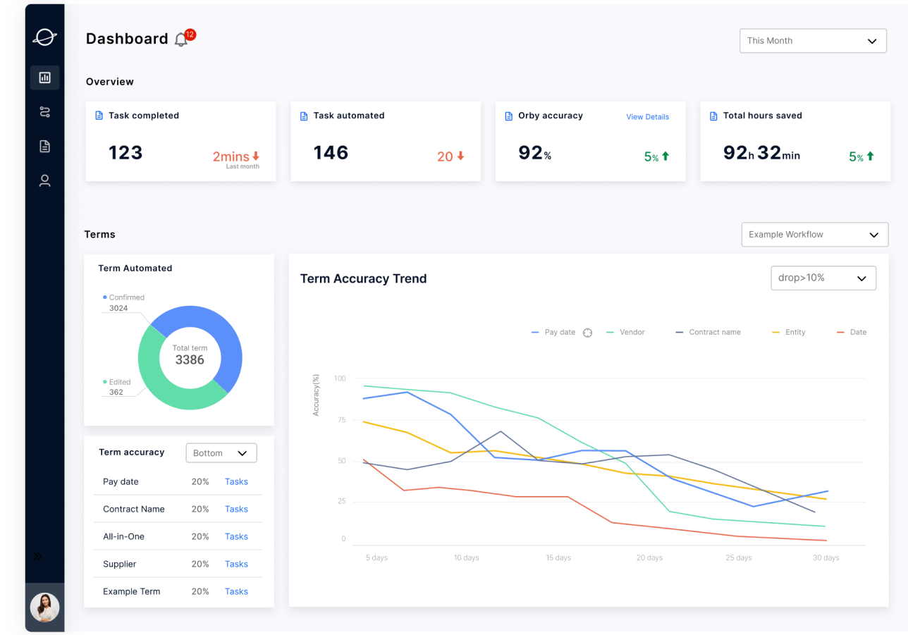
Before
After
Instead of using graphs only, the iterated design has numbers with context that help users interpret aggregated data quickly. Users can also compare a number against another number in order to interpret the information.
Numbers instead of Graphs
The new design is easy for users to navigate and intuitive to use. It also has a clearer information hierarchy.
Hierarchy & Insights
The new design allows administrators to better monitor overall users’ activity with aggregated information on the right side and a bubble chart to drill down to specific users.
Peek of team performance
06 UI Design Component
1.The card
Clearly display data and trends, and provide access to view details
2.Universal Filter
Control the whole page
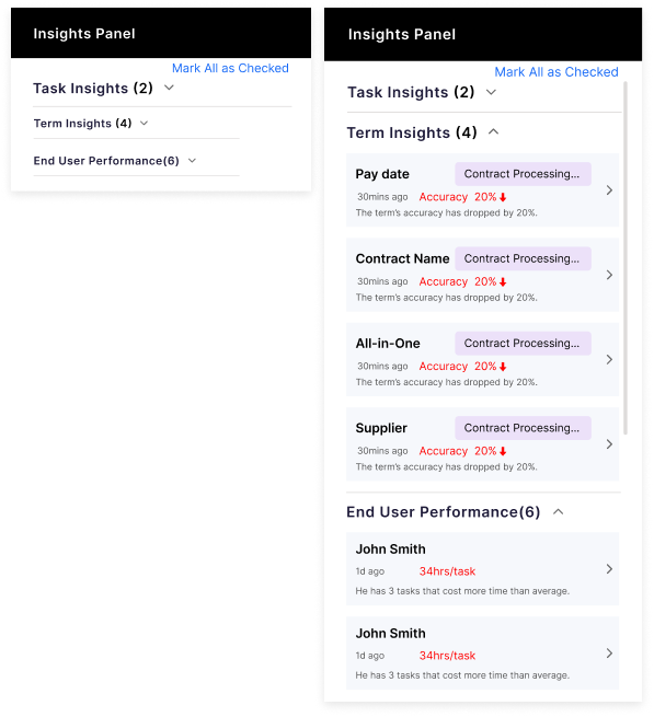
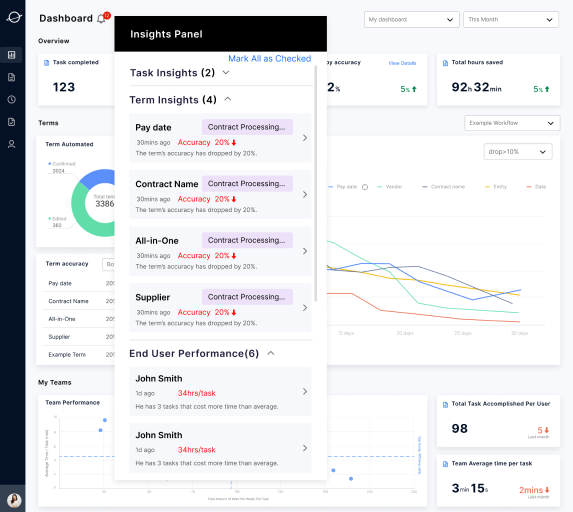
Give the user a brief alert of outliers among task, term, and end users.
Once expanded the admin/ user could have a quick navigation to the specific item they would like to check.
3.The Insight Panel
Final Design
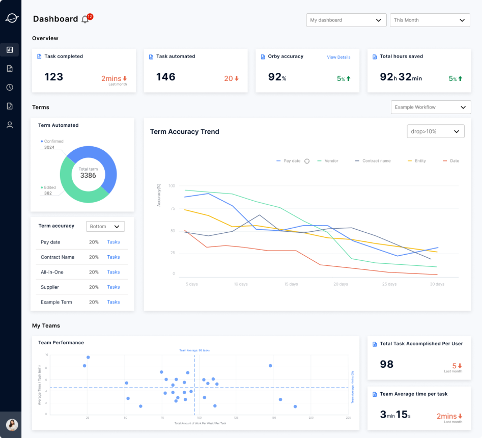
01 Dashboard layout
1.Overview
Task Completed
identify tasks to be done
Task Automated
how much Orby helped
Orby Accuracy
be more confident about Orby
Total hour saved
time saved with Orby’s help
2.Task & Term
Task Processed
how many tasks Orby helped
Task Accuracy
help identify outliers (terms)
Term Accuracy Trend
help identify when outliers(terms) happened and potential reasons
3.Team Performance
Team Performance
identify team outliers
02 Scenario to Feature
Scenario 01: Insight Panel
When admin comes to the dashboard, trying to easily get the guidance on what he needs to pay attention to today.
click the insight panel, Carol noticed that certain terms and low-performance end users were showing up frequently. So she plan to investigated further and found the discrepancies and errors that were responsible for the low performance.
Feature
Scenario 02: Team Performance
Admin comes to the dashboard to check the team's performance. He would like to quickly find the outliers in the team.
By hovering at the scatter of the user Karen Aderson, there will show the detail of Karen’s performance. Karen finished 148 tasks this week and his average time per task is 8 minutes. compare with the average duration of 3 mins 15 seconds, Karen spent over twice the time dealing with tasks. Admin decides to book am 1 o 1 meeting with Karen.
Feature
Scenario 03: Daily Checking
Before the End User started his daily job to validate Orby’s suggestions. She would like to know if there is any term she needs to pay attention to.
The End User sorts the terms accuracy to check the bottom 5 terms. He noticed that the “pay date” there is the lowest accuracy in the ranking. He selects it and hovers over the line chart to see its trend. the insights show him that the “pay date” has dropped 30% in the past 18 days. He has to check it more carefully in the document.
Feature
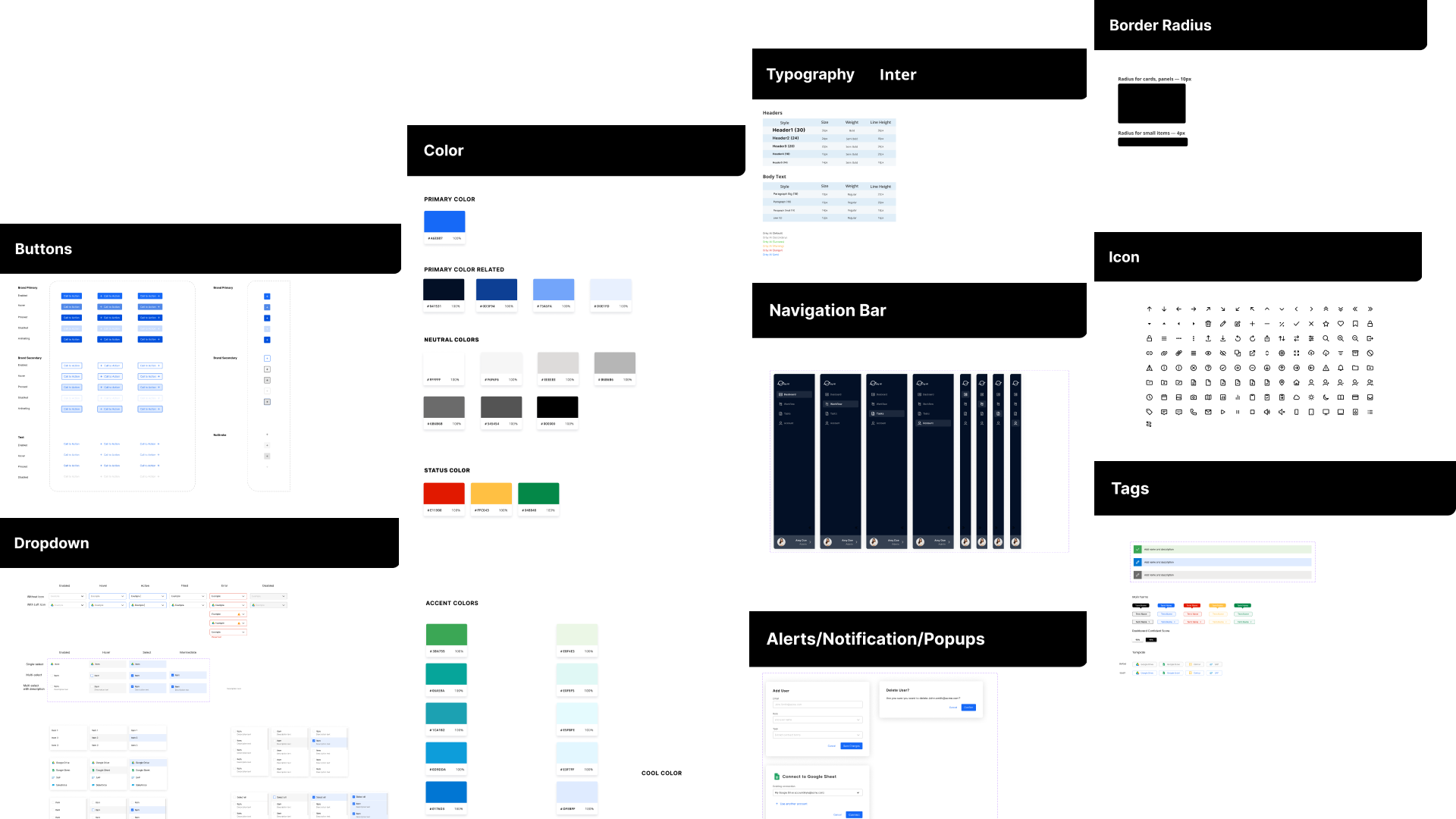
Design System
Based on preliminary research and analysis, the components of the original interfaces have been re-designed into the following design system. It can be used for the company's current and future products.


